Vanguard | Modernizing Asset Transfers
The Project
Modernize a high-friction legacy journey. Vanguard’s Transfer of Assets (TOA) flow was one of its most important—and most frustrating—experiences. Data showed frequent errors, user confusion, and high call-center volume.
The Strategy
Build clarity, confidence, and momentum. Educate early, simplify decisions, and integrate e-signatures—while staying compliant.
Why It Matters
This work modernized a legacy experience and delivered real results:
+8% user confidence after clarifying terms and expectations on the TOA landing page.
+6.5% completion in <2 months after simplifying content and adding DocuSign.
–10% support tickets (with consistent terminology and better self-service).
Reusable content patterns and fragments for future flows.
Services
Content Design, UX Writing, Microcopy, Journey Mapping, Education Strategy, Privacy & Compliance
Improving the first impression: TOA Landing Page
Challenge: Support logs and analytics showed that many users struggled to understand the transfer process, leading to hesitation and extra support calls.
Strategy: Enhance education, self-service, and intent clarity at step one: the landing page.
Approach: Partnered with Research and Call Center to surface top questions, then rewrote the page with a plain-language explainer, decision cards, and a “before-you-start” checklist; validated via quick tests and shipped multiple reusable TOA fragments to drive scalability and consistency.
Key content changes
Hero that motivates.
Replaced vague brand language (“save time,” “share better”) with tangible benefits (“treat yourself to the benefits of consolidation”) to build trust and motivation right away.
Upfront education to reduce confusion.
Usability studies showed people often confused transfers and rollovers flows. I introduced a plain-language explainer early in the flow to reduce friction and support successful task completion.
Modular cards that support decision-making.
Added scannable cards with plain-language descriptions for each account type so people can choose the right path. I codified the pattern as a reusable content fragment in the TOA content design system to scale across flows.
Fallback support to ease uncertainty.
Research with support team leaders showed “process uncertainty” was a top issue. So I created a new education landing page and linked to it via the “Learn more” CTA.
To reinforce that support inline, I also added a “3 easy steps” fallback to guide unsure users.
A benefits section that builds trust.
Rewrote this section to highlight user-centered reasons to transfer (like portfolio visibility, tax benefits, and family preparedness).
Used card-based layout and bold, scannable headlines to make content easier to digest.
CTAs that clarify user intent.
Split primary action into Open an account (new users) and Log in (existing), reducing hesitation and backtracking.
FAQs that reduce support calls.
Based on call center input, I surfaced the most common transfer-related questions and reworded answers in plain language.
Also aligned terms like “rollover” and “in-kind transfer” with user expectations to reduce jargon and clarify next steps.
After launching the new landing page, support teams later reported fewer calls about these topics.
Before & after: clearer choices at step one
As part of the broader revamp, this clearer step-one entry point boosted user confidence (+8%), contributed to higher flow completion (+6.5% in under two months), and reduced call center volume (-10%).
Before: Legacy TOA Landing Page.
After: Redesigned TOA Landing Page.
Streamlining Submissions with DocuSign
While redesigning the TOA landing page, we also streamlined the next step: submitting transfer forms. Adding DocuSign replaced paper with e-signatures, and we worked to make the new process as clear, supportive, and compliant as the refreshed page.
I worked closely with product, legal, and tech partners to make sure the DocuSign experience was intuitive, efficient, and FINRA-compliant:
Mapped logic variations based on account type and user status.
Wrote step-by-step microcopy to guide users through each DocuSign stage.
Partnered with legal to balance clarity with compliance.
QA’d flows with engineers to ensure consistency and accuracy across 85% of use cases.
Result: Improved transfer completion rates by 6.5% in less than two months.
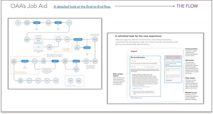
Overview of the onboarding journey with DocuSign integration.
Lessons Learned
Early education reduces friction.
User confusion often starts before a journey begins. Adding upfront guidance—like plain-language explainers and FAQs—helps set expectations and improved user confidence scores by +8% in four months.
Content structure is just as important as copy.
Clear hierarchies, modular layouts, and scannable cards helped users navigate complex decisions without feeling overwhelmed.
Compliance and clarity can coexist.
Working closely with legal partners made it possible to maintain FINRA compliance while still using friendly, human-centered language that supported user understanding.
Success is shared.
This work wouldn’t have succeeded without strong alignment across research, design, legal, and engineering. Regular, collaborative sessions helped uncover issues early and deliver a seamless, user-friendly experience at scale.


