PAN Foundation | Designing for Health Equity
The Project
Create a net-new site that expands clinical trial access. The PAN Foundation partnered with EY to launch a new platform aimed at increasing awareness and access to clinical trials, especially for historically underserved communities. The site needed to serve two distinct audiences: patients looking for support and donors looking to give.
The Strategy
Align stakeholder vision with user needs. I led stakeholder workshops, user research, and content strategy to design an inclusive, accessible site structure that balanced education, equity, and engagement.
Why It Matters
This work brought clarity and equity to a complex healthcare journey:
Enabled easier trial discovery for patients through improved IA and inclusive labeling.
Clarified giving pathways to support PAN’s mission and grow donor engagement.
Helped PAN deliver on its health equity goals with an experience grounded in user research.
Services
Information Architecture, Content Design, UX Research, UX Writing, Stakeholder Workshops, Card Sorting, Content Inventory
Defining the Vision
To ensure the new site met both user needs and PAN’s mission, I facilitated alignment workshops with key stakeholders to:
Identify core user groups and their goals (patients and donors).
Define content priorities for each audience and key actions.
Establish guiding experience principles around accessibility and inclusive design.
This set the foundation for a shared vision and clear requirements heading into research and design.

Visuals from an alignment workshop, showing data insights and user journey exploration.
Understanding the User
I led a research phase to uncover how users think about and search for clinical trial information.
Conducted 14 card sorting sessions to uncover natural content groupings.
Completed a competitive audit of similar health equity orgs.
Performed a full content inventory to identify gaps and duplication.
These insights helped shape a structure that aligned with user expectations and reduced cognitive load.
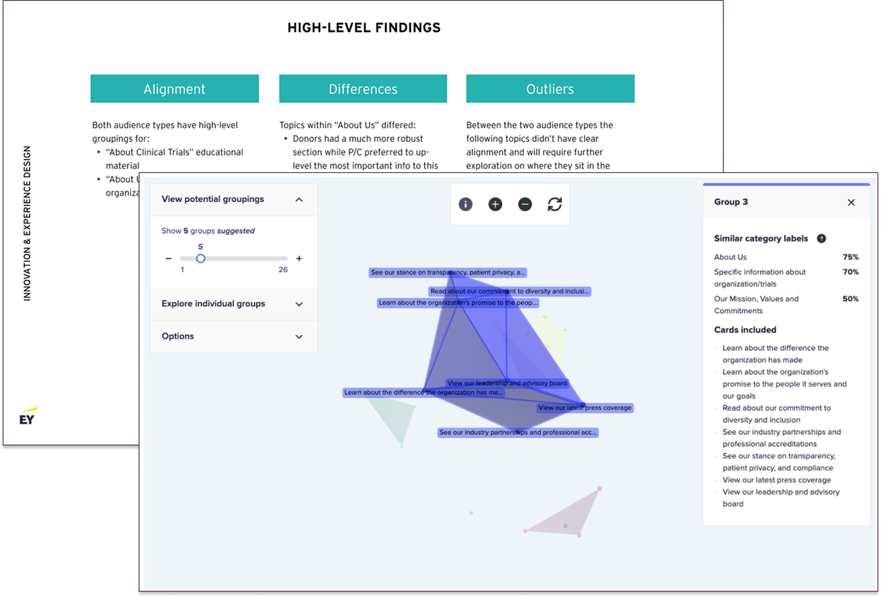
Card sort synthesis snapshot paired with user data visualization created from Optimal Workshop.
Establishing the Framework
I translated research findings into a streamlined, user-centered information architecture.
Created a future-state IA with clearly labeled sections for patients, donors, and researchers.
Refined navigation and labeling to support users with varying levels of digital literacy.
Used annotations and wireframe overlays to communicate structural rationale to the design team.

Snapshot of the proposed information architecture with research-backed annotations.
My Impact
By grounding strategy in research and stakeholder alignment, the site improved clarity and equity for all users:
Improved usability: A clear, structured navigation system streamlined user journeys for patients and donors.
Increased accessibility: Inclusive design ensured the site was easy to navigate for users with varying levels of digital literacy.
Strengthened engagement: Patients could quickly find clinical trial opportunities, while donors had clearer pathways to support PAN’s mission.
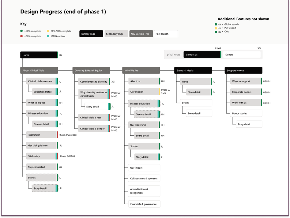
Finalized information architecture overlaid with design schedule phases.
Lessons Learned
Inclusive design starts with inclusive discovery.
Involving diverse users in early research helped shape content that feels accessible and trustworthy.
Mission and UX don’t have to compete.
With clear prioritization, we balanced the foundation’s equity goals with practical user tasks.
Labeling is more than semantics.
The words we used, especially around trial education, had a big impact on trust and understanding. Through research, we also learned that many POC communities carry deep mistrust toward the healthcare system due to a long history of systemic injustices, making clarity and empathy in language even more critical.

Snapshot of PAN Foundation homepage.