Brighthouse Financial | Elevating Insurance
The Project
Reimagine how financial professionals serve their clients. Brighthouse Financial needed to stand out in a crowded retirement market by modernizing fragmented, friction-filled digital experiences—spanning forms, tools, and support content.
The Strategy
Unify content, reduce friction, and empower advisors. I led content strategy and UX writing across 12+ initiatives, creating structures, standards, and copy that improved usability, alignment, and long-term governance.
Why It Matters
This work elevated the advisor and customer experience while helping Brighthouse operate more efficiently:
Created scalable systems and writing standards to improve consistency across journeys.
Reduced support calls and NIGOs by making content easier to find and understand.
Equipped advisors with clearer tools and messaging to build trust and drive results.
Services
Content Strategy, UX Writing, Content Audit, Taxonomy Design, Journey Mapping, Information Architecture, Content Governance, Writing Guidelines
Understanding the Ecosystem
The advisor experience at BHF was siloed, with little visibility into how teams’ touchpoints connected across the full journey.
Challenge: A lack of shared understanding of the advisor lifecycle made it hard for teams to align priorities or deliver a consistent experience.
My Approach: I co-led research and stakeholder interviews to map the advisor ecosystem to develop a service blueprint capturing all touchpoints, from prospecting to post-sale, across digital, physical, and support channels.
Outcome: The advisor touchpoint blueprint has served as a go-to reference for 4+ years, helping onboard new teams, streamline operations, and drive alignment across the organization.

Advisor ecosystem blueprint detailing teams, touchpoints, platforms, partners, and key metrics.
Unifying the Advisor Experience
BHF was redesigning its advisor experience, aiming to better align digital touchpoints with user needs and business goals.
Challenge: Content was inconsistent and fragmented across teams, making it difficult to deliver a cohesive, user-first experience.
My Approach: I partnered with UX and design teams to shape clear content structures and craft flexible, human-centered UI copy. I then created digital writing guidelines to align marketing and web content.
Outcome: The new content strategy improved clarity and trust in the advisor experience while equipping internal teams with tools to maintain consistency at scale.

Content maps for sales tools landing pages and the Advisor 2.0 homepage.
Enhancing Self-Service & Support
As part of the broader Advisor 2.0 redesign, BHF needed to improve support content. Research showed that many users’ first instinct was to call the support center, signaling gaps in the self-service experience.
Challenge: Support content was static, one-dimensional, and didn’t account for varying user needs, preferences, or urgency levels.
Approach: I introduced a mix of content formats (text, FAQs, and interactive tools, etc.) and curated guidance tailored to financial professionals. Each format was chosen to support different user scenarios and reduce reliance on live support.
Outcome: The revamped Support Center improved usability, increased user trust, and empowered advisors with clearer, more accessible self-service options.

Support Center landing page mockup with annotations explaining enhancements to self-service content.
Structuring Content for Discovery
BHF’s Insights section needed better organization to help users find relevant thought leadership while supporting marketing goals.
Challenge: The taxonomy was bloated and inconsistent, making it hard for users to navigate or discover content aligned with their needs.
My Approach: I analyzed the existing taxonomy and usage patterns, then designed a streamlined tagging framework—reducing 43 topics to 12 based on user needs and business priorities. I also aligned navigation and labeling with research insights and delivered governance guidelines to keep content fresh, focused, and scalable.
Outcome: The new system improved discoverability, reinforced BHF’s position as a thought leader, and gave internal teams a sustainable structure for managing content at scale.
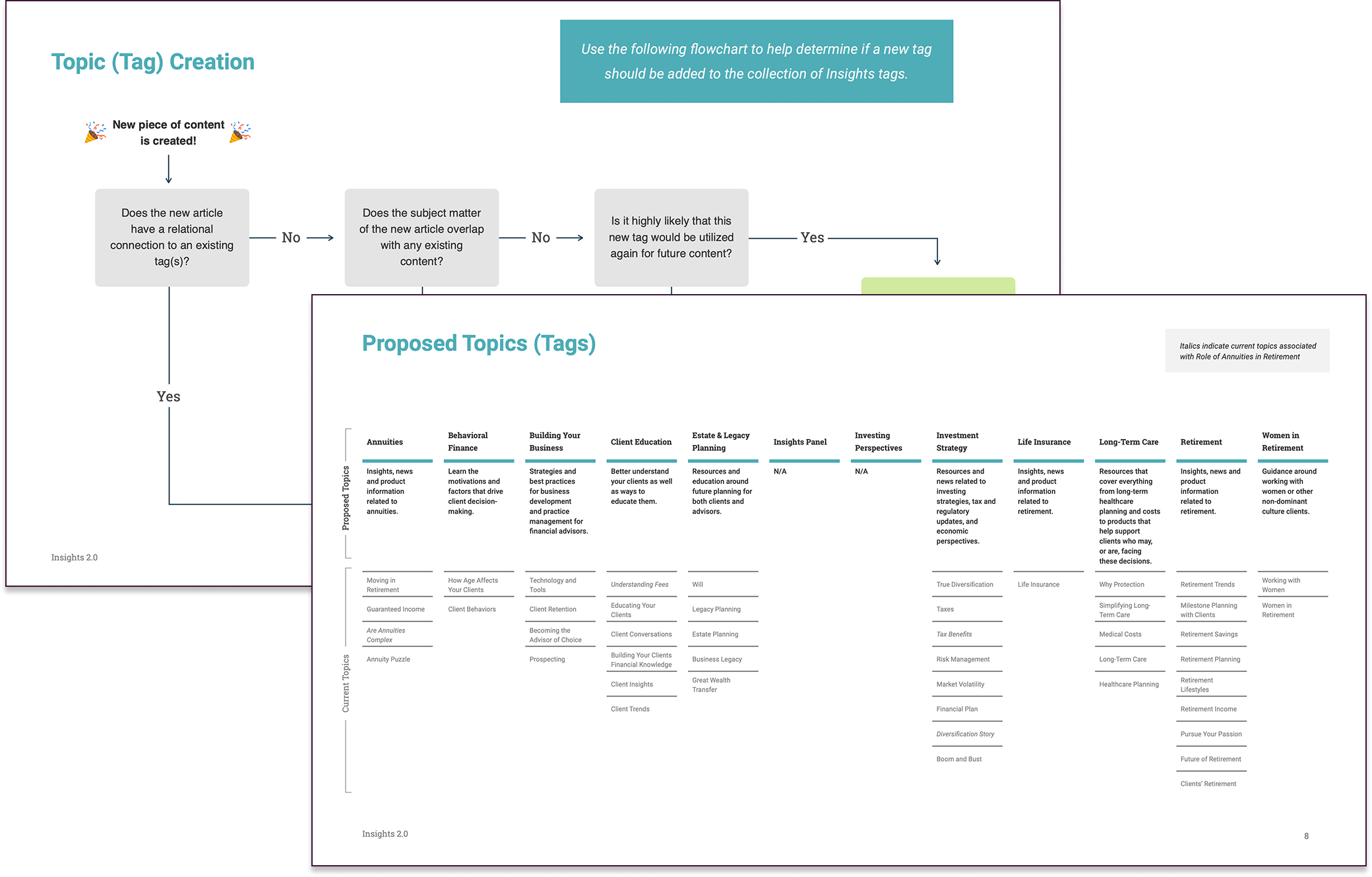
Taxonomy and content classification guidelines for consistent tagging of Thought Leadership content.
Empowering Product Conversations
BHF needed a clearer way for advisors to explain complex retirement products and stand out in a competitive market.
Challenge: Advisors found it difficult to communicate product value, leading to confusing client conversations and missed opportunities.
My Approach: I led content strategy for 6 interactive financial tools, using advisor feedback and sales insights to uncover where messaging broke down. I shaped each calculator around a clear narrative structure—guiding users through product benefits step by step—and collaborated with UX and design to ensure flows aligned with real-world advisor needs and client goals.
Outcome: The tools helped advisors tell more confident, compelling product stories—boosting client engagement and prompting BHF to request similar tools across additional product lines.

Narrative ideation workspace for a new sales tool, shown alongside its full linear flow.
Improving Forms and Search
Advisors were frustrated by the Forms Center experience at Brighthouse Financial, often selecting the wrong forms or needing to call support for help.
Challenge: Inconsistent naming, unclear descriptions, and poor categorization made it difficult for users to find and complete the right forms—leading to high NIGO (Not-In-Good-Order) rates and increased support volume.
My Approach: I used advisor research and form usage analysis to identify where naming and structure caused confusion. I created a taxonomy system to standardize form names, descriptions, and metadata, improving searchability. I also added FAQs and a dynamic banner to support first-time users.
Outcome: Qualitative feedback confirmed that our Forms Center enhancements improved usability, fewer NIGOs, and a noticeable drop in call center volume.
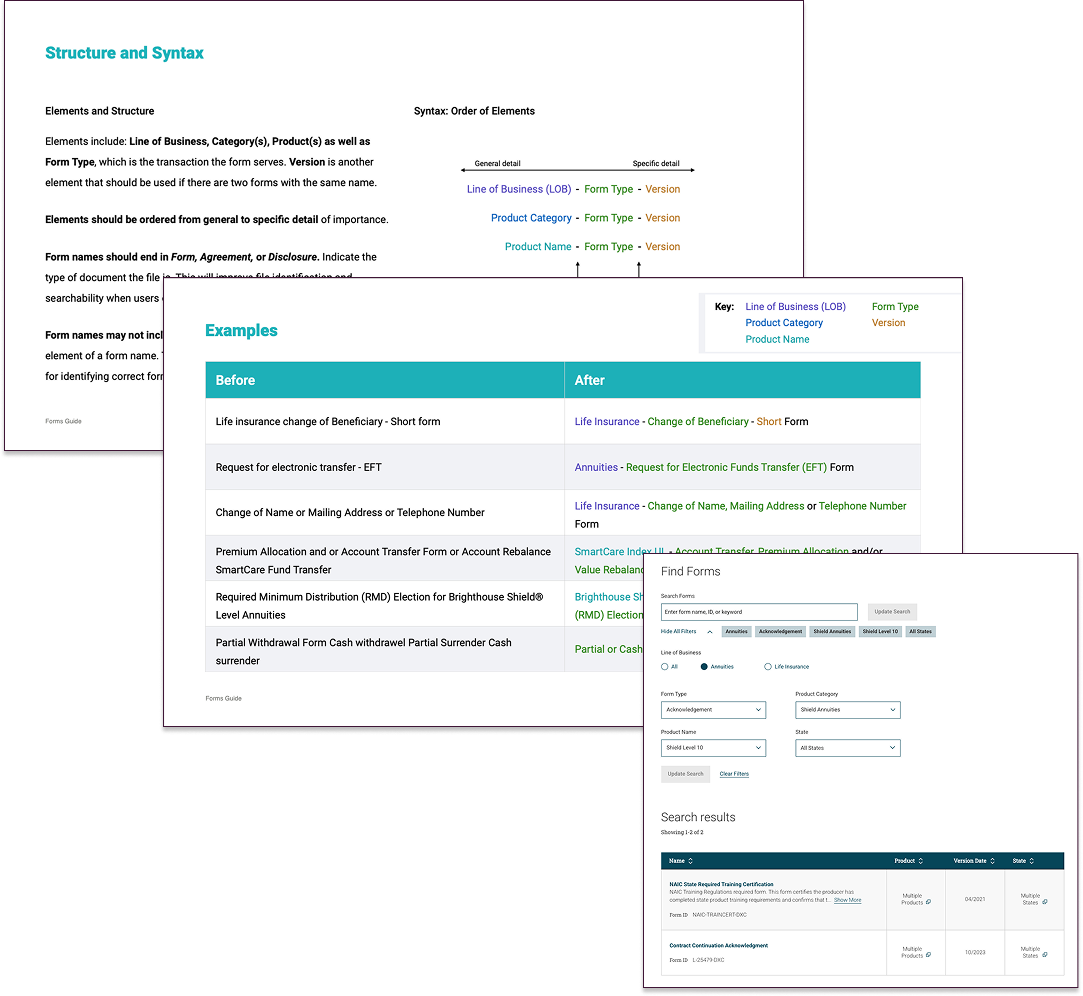
File naming and tagging guidelines alongside a screenshot of the live Forms Center experience.
Lessons Learned
Content is connective tissue.
Helping advisors succeed meant addressing not just copy but structure, access, and discoverability.
Systems reduce dependency on support channels.
Consistent naming and content patterns led directly to fewer errors and customer support calls.
Design for their day, not ours.
Tools and forms had to match how advisors actually talk to clients—not just what the business wanted to say.
Alignment takes groundwork.
Mapping the full advisor ecosystem upfront made it easier to deliver consistent, usable experiences across teams.

Snapshot of the consumer site’s homepage.